It all began with a love of fonts and a desire to create pretty things.
We began connecting during our first year as ITRTs with Hanover County Public Schools. Assigned to work together on a project, we quickly discovered a mutual obsession- design. This fascination with design, however, was not based merely on creating a pretty product. It was a direct application of it to PK-12 education and the science of learning.
On a scientific level, learning is the creation of schemata (or organized units of stored information). When we are presented with information, our brains cross-check existing schemata and determine if this information has previously been stored. If so, the schema is strengthened. If not, a new schema is created and learning has occurred (Pappas, 2019b).
The human brain is constantly working; science calls this “cognitive load.” This load is comprised of three parts: intrinsic, the effort associated with a particular concept; extraneous, the way information and tasks are presented to the learner; and germane, the work required to permanently store information. This is the creation of schemata (Pappas, 2019b).
As educators, we can neither control the intrinsic workload placed on our students; some tasks or concepts are just intrinsically more difficult than others, nor can we control the effort required to create schemata (In fact, we want to encourage this.) We can, however, help reduce the extraneous cognitive load through the purposeful design of educational resources.
Quality design is intentional. Every font, color, picture, word, and alignment choice are deliberate. The goal is to reduce distractions by allowing the brain to focus on what’s important- the content. Quality design helps translate complex information into material that is easier for the brain to process, understand, and ultimately remember.

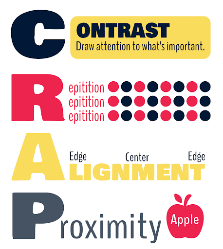
At the most basic level, graphic design can be explained using the CRAP acronym. By purposefully using Contrast to emphasize the important items, the brain is able to easily recognize the significance of the word or concept. Contrast is not simply related to color. Texture, size, shape, font choice, and direction can drive the reader’s attention to specific elements in a design (Deshdeep, 2019).
Repetition relates to the consistency of the design; it helps readers familiarize themselves with the way information is presented. Consistency provides familiarity, and familiarity allows the brain to focus on the concepts, not the distractions. (Deshdeep, 2019)
Alignment refers to the organization of text and images. There are two basic kinds of alignment, center and edge. Random alignment is hard to achieve and often results in messy organization, confusing the brain and drawing attention away from the important words or ideas (Deshdeep, 2019).
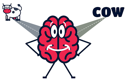
Proximity, the final design principle, suggests that items that go together should be placed together. This is particularly important when placing text and images in a design (Deshdeep, 2019). The Theory of Dual Coding suggests that the brain must utilize two channels of information in order to best retain information. The verbal channel receives both auditory and written expressions of words. Alternatively, the non-verbal channel receives images. When the brain receives both verbal and non-verbal representations simultaneously, it is best able to associate meaning to a particular concept. By placing related text and images in close proximity, the brain is better able to recognize that these two items go together, and both channels of the brain are activated (Pappas, 2019a).
Graphic design is only part of this puzzle. In addition to following basic design principles, educators should pay special attention to the design of instruction. Effective instruction must be grounded in theory. As teachers, we often become hypnotized by the latest trends and strategies. It is important to remember that learning is a science, and for instruction to be effective, we must teach in the way that the brain learns best.
As our experience as ITRTs and instructional designers has expanded, so too have our opportunities to share our ideas with others. Each of the following projects is modeled on the simple idea that, with the inclusion of graphic design principles and a foundation of educational theory, both students and educators can master even the most difficult of concepts.

It all began with a love of fonts and a desire to create pretty things. It grew into a passion to inspire others.
Our Current Project List:
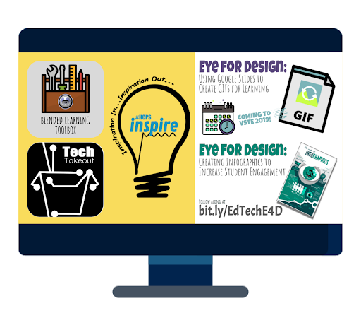
Ongoing – #HCPSInspire 2020: Hanover County Public Schools educator conference, by teachers for teachers.
Ongoing – Tech Takeout: Professional development (PD) created as bite-sized takeaways at Patrick Henry High School and Chickahominy Middle School in the 2018-2019 school year. In person PD in combination with an online Schoology course of supports (how-to documents, student examples, ideas for content areas, and opportunities to share).
Ongoing – Blended Learning Toolbox: An interactive learning object (interactive presentation) complete with a Google Doc index of how-to guides for a variety of blended learning strategies and tools.
Dec. 2019 – VSTE: Eye for Design: Using Google Slides to Create GIFs for Learning: Students love GIFs. Let’s use that to our advantage! In this fun, interactive session, you will learn how to utilize Google Slides to make Stop Motion GIFs that your students will love. They’ll have so much fun; they won’t even know they’re learning!
References
Deshdeep, N. (2019, August 4). Build Better User Experience With C.R.A.P. Design Principles. Retrieved October 22, 2019, from https://vwo.com/blog/crap-design-principles/.
Pappas, C. (2019a, September 26). Instructional Design Models and Theories: Dual Coding Theory. Retrieved October 22, 2019, from https://elearningindustry.com/dual-coding-theory.
Pappas, C. (2019b, September 24). Instructional Design Models and Theories: Schema Theory. Retrieved October 22, 2019, from https://elearningindustry.com/schema-theory.
Authorship Information
Amelia Buchanan is an Instructional Technology Resource Teacher with Hanover County Public Schools. Her love of technology and mission to promote meaningful and engaging learning experiences for students evolved from being a mediocre middle school student and a semi-engaged high school band nerd. Finding herself at Longwood University, she chose to pursue Elementary and Middle Education, an interest kindled from a love of teaching in Girl Scouts. After eight years of teaching social studies in middle schools, she transitioned into the ITRT position to share her love of instructional design and student engagement with other educators. Amelia has her Masters in Educational Technology from James Madison University. Outside of work, she can be found on family adventures with her husband, Ryan, wrangling two beautiful daughters, Irene (6) and Emmelyn (3).
Laura Cooper is an Instructional Technology Resource Teacher with Hanover County Public Schools. Previously as a Biology teacher, Laura focused on making complicated information easy for students to understand. Rather than memorizing every scientific fact, she tasked her students to master the basics and strove to help all students develop a love of science and learning. Now, as an ITRT, she works with teachers to do the same in their classrooms. Laura is a Nationally Board Certified Teacher and a Google Certified Trainer. She earned her Masters in Instructional Design and Technology from the American College of Education. Her biggest source of pride, however, is her family: Brian, Mackenzie (12), Chase (8), and her two furry dog-children, Charley and Zoey. Follow Laura on Twitter: @ITRTSupaCoopa
Originally published November 22, 2019

